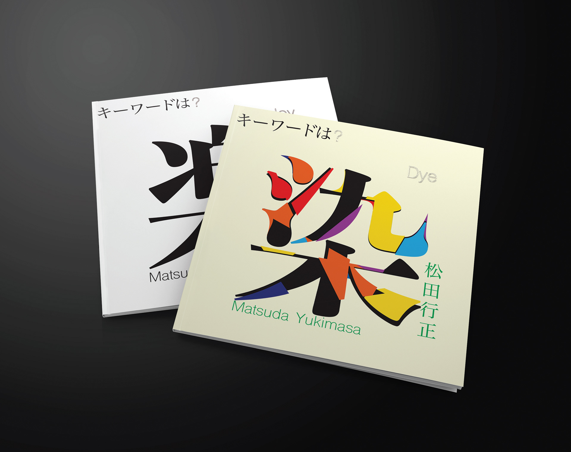
COLOR. TY-pO'GRA/pHy.
TWO BOOKLETS.
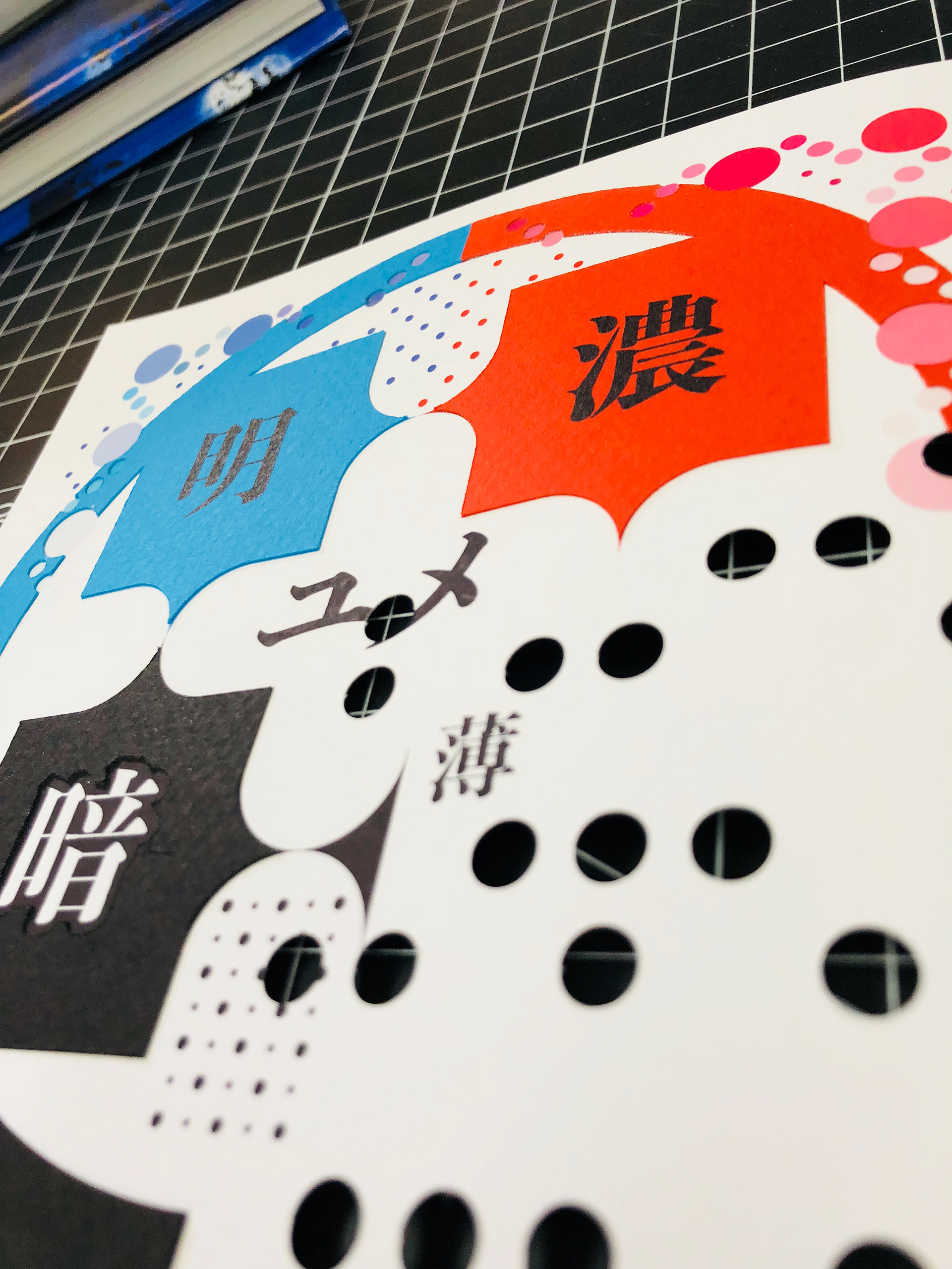
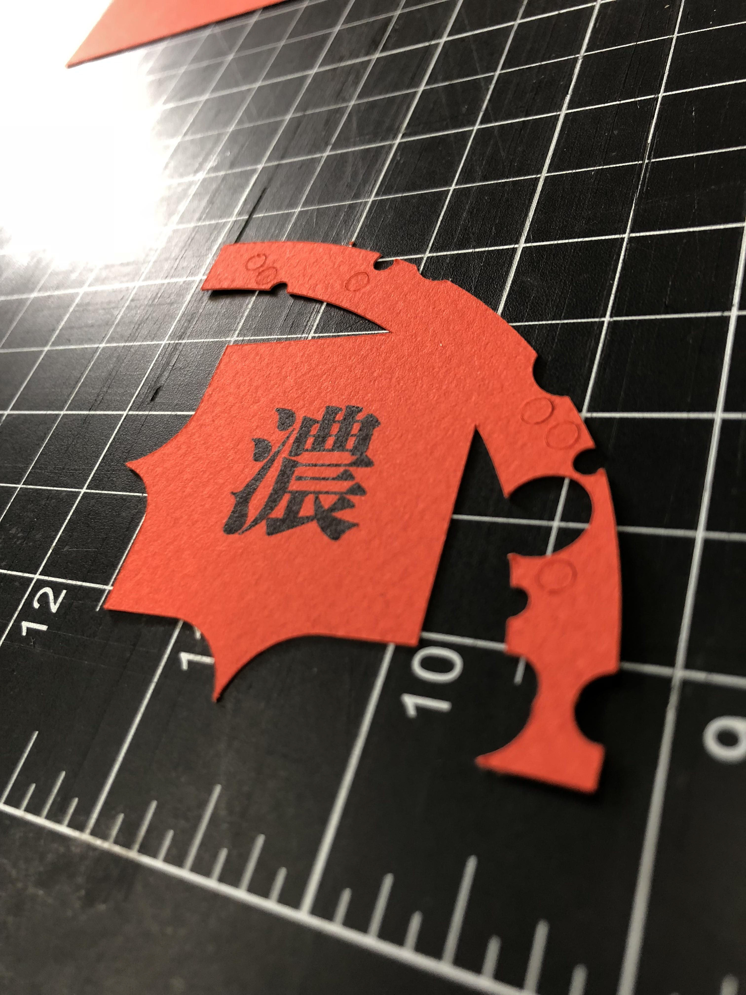
Introduction: Matsuda Yukimasa is a famous publication/book designer based in Japan. After reading two of his books and various researches online, Matsuda can be described as a storyteller first, then a designer. "Interaction beyond paper and text" takes a big part in his design philosophy, thus in the case study I designed two interactive booklets that analyzes his way to communicate history and science in his books with the reader.
Concept: The analysis would be breaking down into two main categories: text and color. Text lays the foundation of the overall message, design and color plays the role of making the delivery into the mind. Knowing that Matsuda pays a tremendous amount of attention to details in his book design, I carried on the idea and had made various gimmicks in the booklet to make them as amusing to interact with as possible.